

If there’s one thing I’ve always loved about designers, it’s that we’re easily inspired and excited by others! I, personally, enjoy gathering takeaways and tidbits from other graphic designers and incorporating the things that make sense for me into my design process. As my process grows, so do the end result and overall client satisfaction.
“A robust process equals a powerful result.” Click To Tweet
As an instructional designer, you too might find yourself inspired by others’ learning designs. My goal in this blog post is to point out a few graphic design tips that may help you push past a creative slump, identify a visual hurdle, and seek new sources of inspiration (and maybe save yourself some time while doing it)!

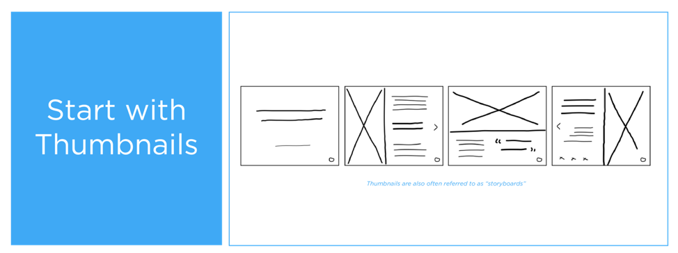
Create Design Thumbnails
Start off with a strong foundation by building intention from the very beginning of a project. Once you receive your task or design duties, avoid diving straight into plugging in the content and language you’re provided. Instead, begin by making thumbnails (or a storyboard). These thumbnails can be digital (I use the Graphic app on my iPad) or physical –– the goal is to create an intentional framework for the task you’ve been assigned. Many graphic designers use this strategy when building early logo concepts or designing website pages, but it can also be extremely helpful when creating layouts or a succession of slides in a presentation deck. The important thing to remember is to not get overly attached to your early-stage thumbnail. It is meant to be a quick and cost-effective brainstorming tactic –– think of it as a prototype that will likely see several changes before the final product.
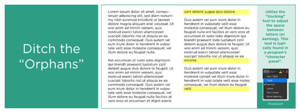
Ditch the “Orphans”
As much as I wish this “typesetting” had a different name, its literal label will likely stick in your memory. In the world of graphic design, we are taught that an “orphan” (also referred to as a “widow”) refers to that one word lingering on its own line at the end of a paragraph. Although seemingly innocuous, that single stranded word has the power to create a noticeable imbalance in your overall layout, whether in a presentation slide, printed learning material, or website. Adjust your kerning (space between letters) for a quick-fix solution!
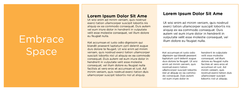
Embrace S P A C E
You’re probably chuckling and thinking, “Lady, you have no idea the amount of content my SME has requested to be included on a single slide. Space has no place here.” I’ve been there, and I believe you. Let’s try to think outside the box, though…starting with borders.
- Borders, Boxes + Lines: There are times when borders, boxes, or lines can help differentiate space or information. There are also times when adding borders, boxes, and lines simply contributes additional visual clutter. Play with each option to figure out which is most effective in your situation.
- Padding: Just like us, letters appreciate a bit of personal space. Give them some breathing room to increase overall legibility and lower stress on the readers’ eyes. Even the slightest adjustment can make a big impact! This could include any or all of the following: adjusting the kerning (space between letters) in a header, changing the line height (space between lines of text) in body copy, or increasing gaps between headers and body copy. These will, in a sense, create visual “pauses” for those on the receiving end and decrease the likelihood of information overwhelm.
- Hierarchy: Avoid using the same (or very similar) font size and style across the board. That is a recipe for clutter and By increasing the size of one (or a few) element(s), you introduce some visual interest to your layout. But don’t get too overzealous or you’ll end up with the same problem you started with. In this blog post, I share a little bit more on hierarchy, including a helpful visual to keep on hand.
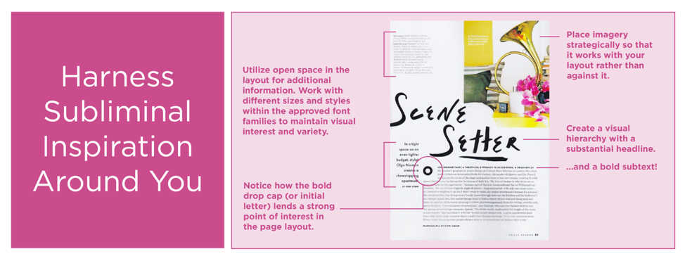
Harness the Subliminal Inspiration
More often than not, I’ve found inspiring examples of well-executed design while I’m thumbing through a magazine in a waiting room, attending a webinar, or scrolling through Pinterest. In those “aha!” moments, snap a picture of the magazine page and text it to yourself with some reference notes to revisit once you’re back at your desk. Take screenshots (if permitted) of stellar presentation slides or save design images to an “Inspiration” folder! We are confronted with good (and poor) design EVERY DAY. Harness the good…dissect it and determine what draws you in so that you, too, can implement successful elements of graphic design into your training.